

Enhancing Salesforce Record Pages with abbInformativeIcons LWC
Use Case
In today’s dynamic business environment, Salesforce administrators and developers are always looking for ways to improve the user experience by making critical data more accessible and visually intuitive. The abbInformativeIcons Lightning Web Component (LWC) is a powerful, native solution that allows you to emphasize key information on Salesforce record pages using visual icons, including custom SVGs, without requiring any Apex code.
Whether you need to highlight a prospect’s status, indicate an account’s priority, or show any custom visual cue, abbInformativeIcons provides a flexible and easy-to-configure tool that integrates seamlessly into your Salesforce environment.
General Overview
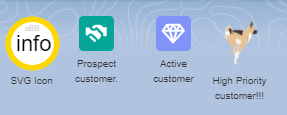
abbInformativeIcons is a fully native LWC that allows you to display icons based on record data conditions. The component can display standard Salesforce icons, images, or even custom SVG icons provided as strings. It leverages the power of JSON configuration to define which icons should be displayed and under what conditions, making it incredibly flexible and easy to set up.
Key Features:
- No Apex Code Required: This component is purely LWC-based, requiring no backend logic or Apex classes.
- Dynamic Icon Display: Icons are displayed based on conditions that evaluate record data in real-time.
- Support for Custom SVGs: You can provide custom SVG markup as a string, allowing for fully custom icons to be displayed alongside standard Salesforce icons.
- Responsive and Configurable: The size of the icons can be adjusted to fit the design needs, and the component is responsive to the user’s configuration needs.
- Support for Animated GIFs: You can use animated GIFs to bring dynamic and attention-grabbing visual cues to your Salesforce pages. In below sample dog is running.

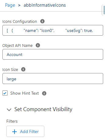
How to Set Up
Setting up abbInformativeIcons on your Salesforce record pages is straightforward. Here’s a step-by-step guide:
[
  {
    "name": "Icon0",
    "iconName": "action:user",
    "hintText": "Active Account",
    "condition": "$record.Active__c === 'Yes'"
  },
  {
    "name": "Icon00",
    "iconName": "utility:user",
    "hintText": "Passive Account",
    "condition": "$record.Active__c === 'No'"
  },
    {
    "name": "Icon10",
    "iconName": "utility:lower_flag",
    "hintText": "Low Priority customer!!!",
    "condition": "$record.CustomerPriority__c === 'Low'"
  },
  {
    "name": "Icon11",
    "iconName": "standard:investment_account",
    "hintText": "Medium priority",
    "condition": "$record.CustomerPriority__c === 'Medium'"
  },
  {
    "name": "Icon12",
    "imageUrl": "https://abbsf.com/wp-content/uploads/2024/08/fireIcon.gif?attachment_id=9",
    "hintText": "High Priority customer!!!",
    "condition": "$record.CustomerPriority__c === 'High'"
  },
  {
    "name": "Icon41",
    "useSvg": true,
    "svgMarkup": "<svg width='50' height='50' xmlns='http://www.w3.org/2000/svg'><circle cx='25' cy='25' r='22' stroke='gold' stroke-width='5' fill='white' /><text x='8' y='30' font-family='Arial' font-size='14' fill='yellow'>Warm</text></svg>",
    "hintText": "Warm",
    "condition": "$record.Rating === 'Warm'"
  },
  {
    "name": "Icon42",
    "useSvg": true,
    "svgMarkup": "<svg width='50' height='50' xmlns='http://www.w3.org/2000/svg'><circle cx='25' cy='25' r='22' stroke='red' stroke-width='5' fill='white' /><text x='15' y='30' font-family='Arial' font-size='14' fill='red'>Hot<animateTransform attributeName='transform' begin='0s' dur='10s' type='rotate' from='0 25 25' to='360 25 25' repeatCount='indefinite' /></text></svg>",
    "hintText": "Hot",
    "condition": "$record.Rating === 'Hot'"
  },
  {
    "name": "Icon40",
    "useSvg": true,
    "svgMarkup": "<svg width='50' height='50' xmlns='http://www.w3.org/2000/svg'><circle cx='25' cy='25' r='22' stroke='lightblue' stroke-width='5' fill='white' /><text x='8' y='30' font-family='Arial' font-size='14' fill='blue'>Cold</text></svg>",
    "hintText": "Cold",
    "condition": "$record.Rating === 'Cold'"
  }
]
How to Install
The abbInformativeIcons Lightning Web Component (LWC) is available as an open-source package under the MIT License. You can easily install it in both your production and sandbox environments. Once installed, the component will be ready to use on your Salesforce record pages, allowing you to enhance your data visualization with dynamic icons.
Installation Steps
- Choose Your Environment:
- Decide whether you want to install the package in your production environment or a sandbox environment for testing.
- Install the Package:
- For Production: Click the link below to install the package in your production environment.
- For Sandbox (Test Environment): Click the link below to install the package in a sandbox environment.
- Follow the Installation Wizard:
- After clicking the appropriate link, you will be redirected to Salesforce. Log in with your Salesforce credentials.
- The installation wizard will guide you through the installation process. You can choose to install the package for administrators only, for all users, or for specific profiles.
- Post-Installation Configuration:
- Once the package is installed, you can start using the
abbInformativeIconscomponent by adding it to your Salesforce record pages via the Lightning App Builder. - Refer to the “How to Set Up” section of this blog post for detailed instructions on configuring the component with your desired icons and conditions.
- Once the package is installed, you can start using the
Conclusion
The abbInformativeIcons LWC is a versatile and powerful tool that enhances Salesforce record pages by providing visual cues that are easy to configure and highly customizable. This component is especially valuable because it operates entirely on the front end, meaning no additional Apex code or backend logic is required, making it a lightweight and efficient solution for Salesforce admins and developers alike.
By leveraging this component, you can significantly improve the user experience on your Salesforce platform, ensuring that important information is always highlighted and easily accessible. Explore the possibilities with abbInformativeIcons and bring your Salesforce pages to the next level of usability and design.
OTHERS
Open-Source and License
This component is released as an open-source project under the MIT License, which allows you to freely use, modify, and distribute the component in your Salesforce environment. We encourage you to explore the code, contribute to the project, or customize it to fit your specific needs.
By installing this package, you’ll have access to a powerful, no-code solution for enhancing your Salesforce pages with visual icons that respond to real-time data.
Warranty and Disclaimer
No Data Writing or Deletion
When you install the abbInformativeIcons component via the provided package installation links, please be assured that the component does not perform any data writing, modification, or deletion operations on your Salesforce system. The component is purely visual, designed to display icons based on your Salesforce data conditions without making any changes to your actual data.
Custom Modifications and External Versions
The abbInformativeIcons component is provided as an open-source package under the MIT License, which grants you the freedom to use, modify, and distribute the component. However, any changes you make to the source code or any installations of modified versions of the component from sources outside of this page are done at your own risk.
We do not guarantee the functionality, security, or stability of the component if the source code is altered or if a different version is installed. Any issues arising from such modifications or external installations will not be covered under our support.
Disclaimer
The abbInformativeIcons component is provided “as-is” without any warranties, express or implied. While we have thoroughly tested the component and believe it to be a valuable tool, we disclaim any liability for damages resulting from its use. This includes, but is not limited to, issues related to data integrity, system performance, or security vulnerabilities that may arise after installing the component, particularly if it has been modified or sourced from another location.
By installing this component, you acknowledge and agree that you are using it at your own discretion and risk. We recommend thoroughly testing the component in a sandbox or test environment before deploying it to production.